Work
About
Contact
Work
About
Contact
Work
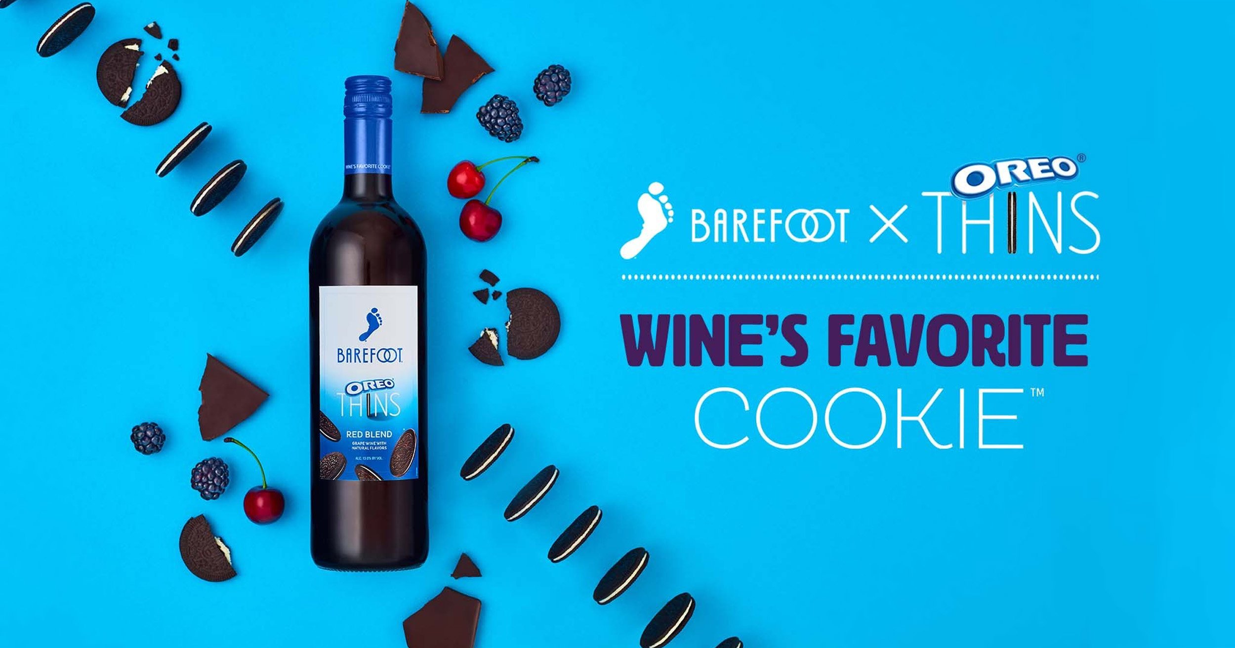
Barefoot x Oreo
High Noon
Interior Spread
La Marca Prosecco
Fitness & News Editorial